Customize the formatting of your charts.
Topics on This Page
Copy and Modify an Existing Color Palette
Move an Axis Left, Right, Up, or Down
Stack Multiple Measures on a Bar, Column, or Waterfall Chart
You can apply consistent formatting for measure data across data axis labels,
tooltips, and display values. Formatting at the chart level, as described
in this topic, overrides data-level formatting.
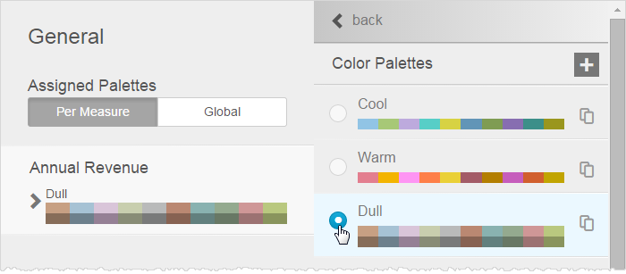
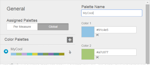
Assign a Color Palette
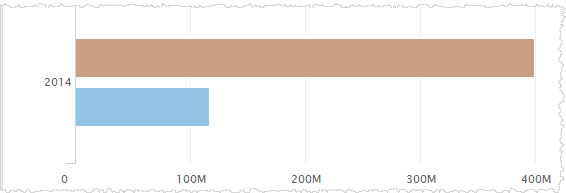
You can assign a built-in or custom color palette to the entire chart and to each measure. Color palettes are shared among your company's Insights users.
- Click Chart Formatting.
- In the Chart Formatting panel, click the
General tab to display the palette options. Click Global and select a palette
to set a color scheme for the entire chart.
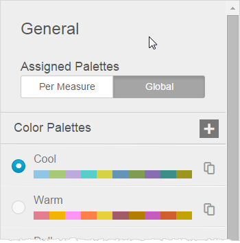
- Click Per Measure to see measures and their current color palettes.
- Click a measure's
palette to open a list of available palettes.
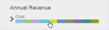
- Select a palette and click Back.
- The chart immediately updates so you can preview the colors.
- Click Done.
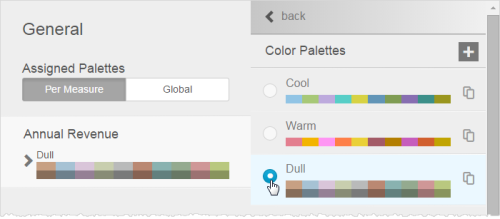
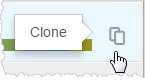
Copy and Modify an Existing Color Palette
Only the creator of a palette or an administrator can modify the palettes of an existing account.
- Click Chart Formatting.
- In the Chart Formatting panel, click the General tab to display the palette options.
- Click either Per Measure or Global, depending on the scope of the changes.
- Click Clone
on the palette you want to copy and modify.
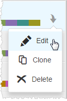
- Click
Edit on the cloned palette.
- In the Palette
Editor, name the new palette.
- Use the Color
Picker or type the hex codes to change colors in the palette.
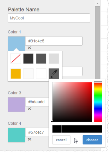
- Click Done.
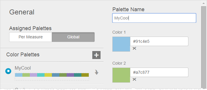
Create a Color Palette
- Click Chart Formatting.
- Click the General tab to display the palette options.
- Click either Per Measure or Global, depending on the scope of the changes.
- Click Add
Color Palette.
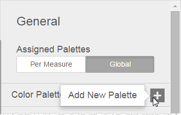
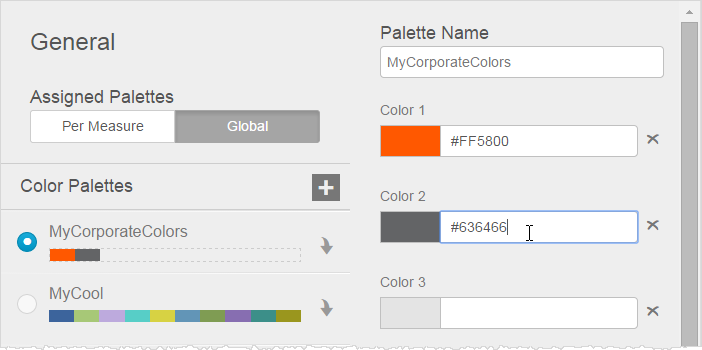
- Name your new palette.
- Use the Color
Picker or type the hex codes for the colors you want to use. As you add colors, the chart previews them.
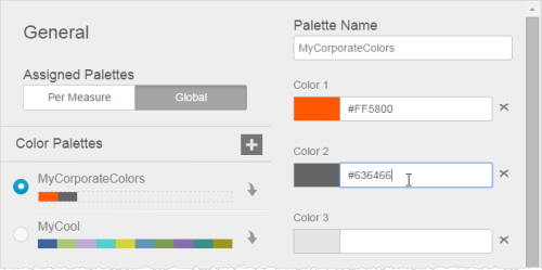 Note: The order of the colors you add, from left to right, determines the default order of the colors as they are applied in charts.
 - When you finish your palette, click Done. The new palette displays in the Chart Formatting Color Palettes tab.
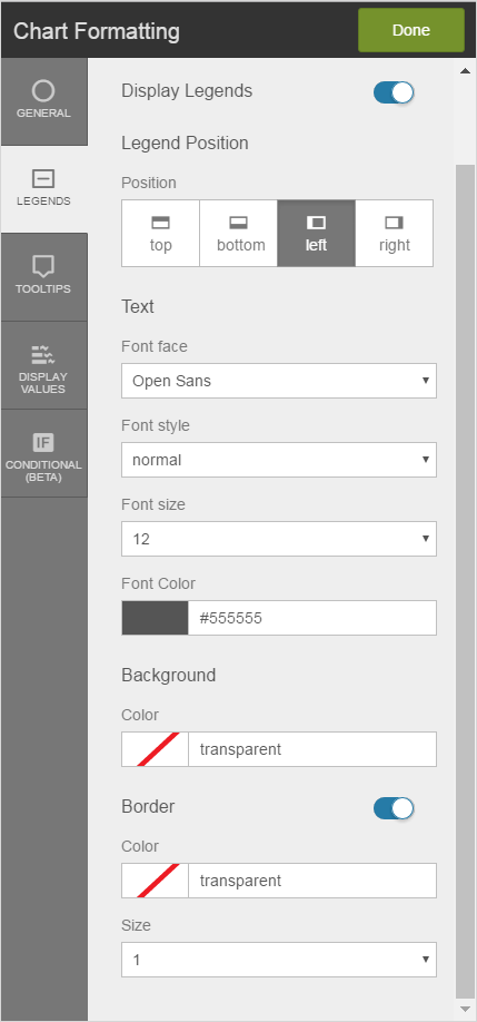
Format Legends
- Complete one of the following processes:
- Hover over the legend bar, then click Formatting.
- Click
Chart Formatting, then click
the Legends tab. The Chart Formatting Legends panel opens.
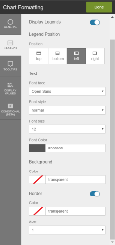
- In the Chart Formatting Legends panel, enable Display Legends.
- Change position of the legend.
- Format the text.
- Change the background color of the legend.
- Format the legend's border.
- Click Done.
Change Axis-Label Text
- Double-click the
label for either the X-axis or the Y-axis of your chart.
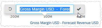
- Type the label
you would like to use, then type Enter or click Check. Tips:
- If you do not want to display an axis label, delete all of the text.
- To restore a label, click Reset Alias.
- If labels overlap each other, Visualizer may not display all of them; this is to avoid visual clutter, especially when reports resize to smaller displays.
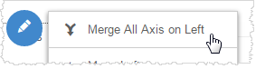
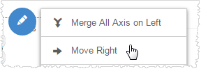
Merge or Split Multiple Axes
If you have a chart with multiple measures that use the same basic data types and ranges, you can merge the axes so that multiple measures use the same axis. By default, Visualizer may automatically merge some axes.
- Hover over an axis to see the Axis menu, then click the menu.

- Click Merge
All Axis On Left or Merge All Axis on Right, depending on where the axis exists.
 Tip: If you do not want a merged axis, hover over it, click the Axis menu, and select Split Axes.
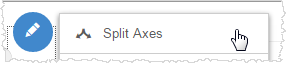
Move an Axis Left, Right, Up, or Down
- Hover over an axis to see the Axis menu, then click the menu.
- For an X-axis, click Move Right or Move Left. For a Y-axis, click Move Up or Move Down. Visualizer repositions the axis.
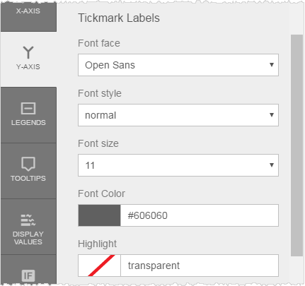
Format X-Axis Labels
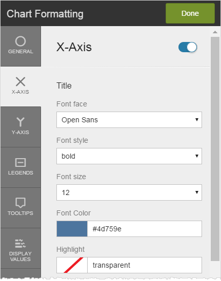
- Click Chart Formatting.
- In the Chart Formatting panel, click the
X-Axis tab, then enable or disable the X-axis label. When disabled, the label does not display on the chart.

- Change the font face, style, size, color, and background highlight of the X-axis main label as needed.
- Scroll down to change the font face, style, size, color, and background highlight of the X-axis tickmark labels as needed.
- Scroll down to change the color and thickness of the X-axis baseline rule, or disable it.
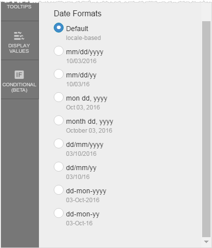
- If using a date type on the X-axis, you can change the date formatting.

- Click Done.
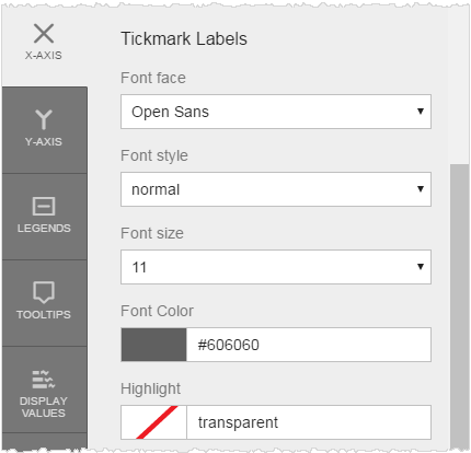
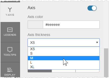
Format Y- Axis Labels
Formatting at the Y-axis level overrides formatting at the data level.
- Click Chart Formatting, then click the Y-Axis tab. You can enable or disable the Y-axis label.
- Change the font color, face, background highlight, size, and style of the Y-axis main label.
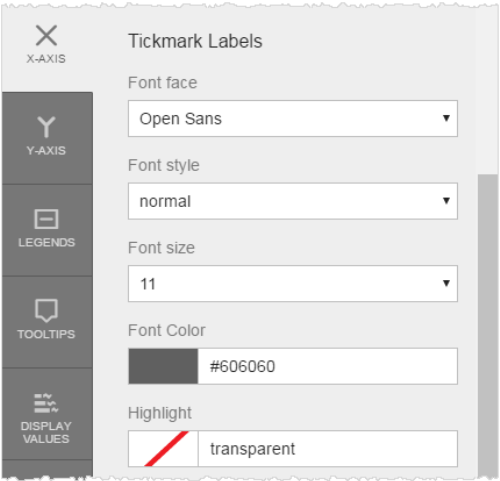
- Change the
font color, face, background highlight, size, or style of the Y-axis tickmark labels.
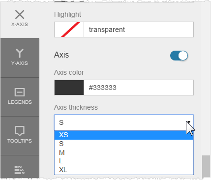
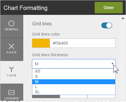
- Format the grid lines. You can change the color and thickness of the grid lines, or you can disable them.
- Scroll down to format the Y-axis vertical rule, or disable it. By default, the rule is gray and the smallest thickness.
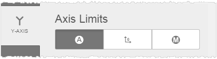
- Format the
Y-axis limits. By default, they are set to Automatic. You can set them to start at zero or manually enter the number of
axis ticks and the minimum and maximum value range.
.
- Change formatting
of the Y-axis data:
- Change the Units display format. The default originates from the underlying data.
- Change the Suffix to percentage, if needed.
- Set the decimal precision.
- Select a currency prefix.
- Click Done.
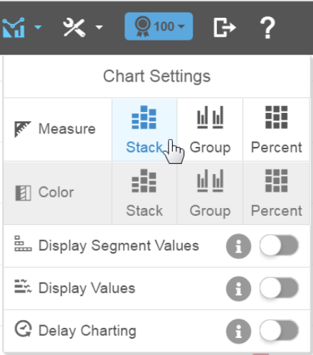
Stack Multiple Measures on a Bar, Column, or Waterfall Chart
Multiple measures are grouped on bar, column, and waterfall charts by default. You can change these to stacked or percentage.
- Click Chart Settings.
- Change the Measure formatting.
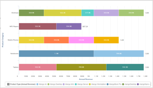
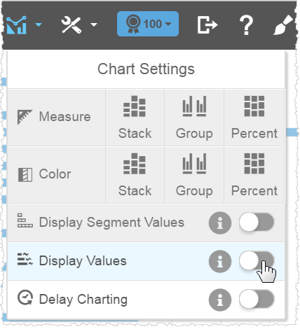
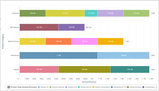
Enable Display Values on a Bar or Column Chart
- Click Chart
Settings. Enable Display Values.
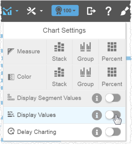
- The value of the measure displays at the end of
the bars in a column or bar chart. If you have a color attribute, you can display the segment values.
Format Display Values
Formatting at the display value level overrides formatting at the data level.
- Click Chart Formatting.
- Click the Display Values tab. You can set display
values for all measures or for each measure.
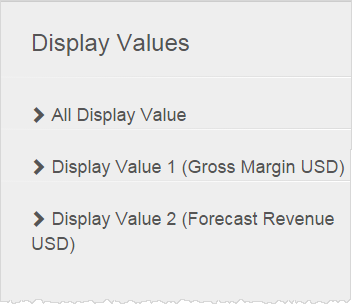
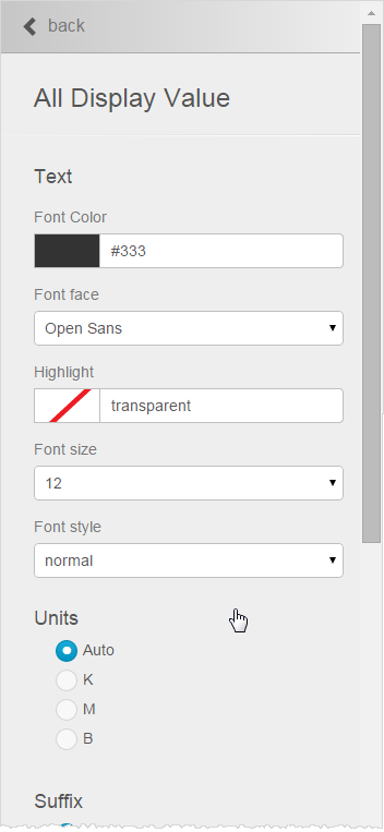
- Click All Display Value, then complete all necessary options:
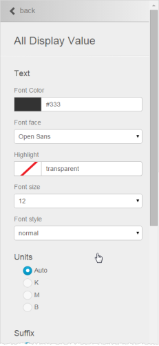
- Specify the font color, face, highlight, size, and style to apply to the entire chart.
- Specify the units, suffix, decimal precision, and currency symbol to apply to the entire chart.
- Click Back.
- Click a measure to apply formatting specific to the measure.
- Specify the units,
suffix, decimal precision, and currency sign to apply to the measure.
Tip: You cannot specify font formats for each measure. Use All Display Values to specify font formatting.
- Click Back.
- Specify the units,
suffix, decimal precision, and currency sign to apply to the measure.
- Repeat for each measure.
- Click Done.
Format Tooltips
You can change the font style, units, suffix, decimal precision, and currency symbol used in tooltips. Formatting at the tooltip level overrides formatting at the data level.
- Click
Chart Formatting, then click
the Tooltips tab. The Chart Formatting Tooltips panel opens.
- If there is only one measure, all of its formatting options display.
- If there are multiple measures, text formatting for all of them together, for consistency, is at the top. Later you can select individual measures to format the other items.
- Check which measures and attributes display in the tooltip.
- Change the font color, face, background highlight, size, or style of the tooltip
text.

- Format the data:
- Change the Units. The default originates from the underlying data. The numbering style changes based on the Unit.
- Change the Suffix to percentage, if needed.
- Set the decimal precision.
- Select a currency prefix.
- Click Done.
Tip: To change the measures that display in a tooltip, see Add Tooltips and Hide Columns.

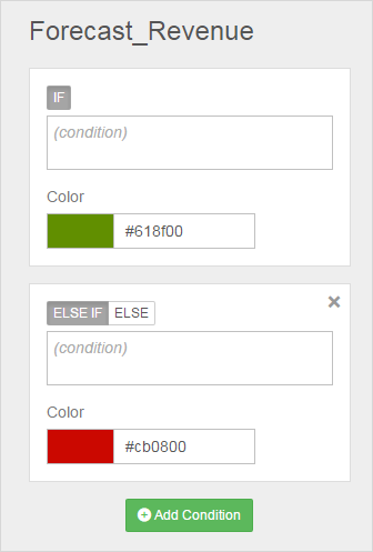
Apply Conditional Formatting
- Create a chart that includes a color attribute.
- Click Chart Formatting.
- Click the Conditional tab. The Basic Formatting panel opens.
- Select color
overrides.
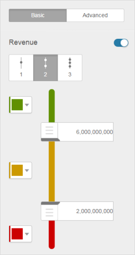
- Optionally, click the Advanced tab for expression-based conditional formatting.
- When you are done, click Apply.
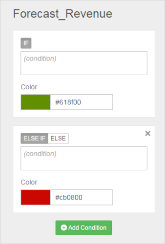
- Click Done.Tip: You can disable the condition without changing all of the settings.

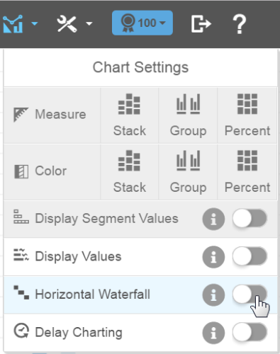
Change a Waterfall Chart From Vertical to Horizontal
Waterfall charts have a vertical orientation by default.
- Click Chart Settings and enable Horizontal Waterfall.